My Role
Research · Layout Design · Flow Design · Component Design · Interface Design

Upgrading the work platform to make it efficient, user-friendly and modern.
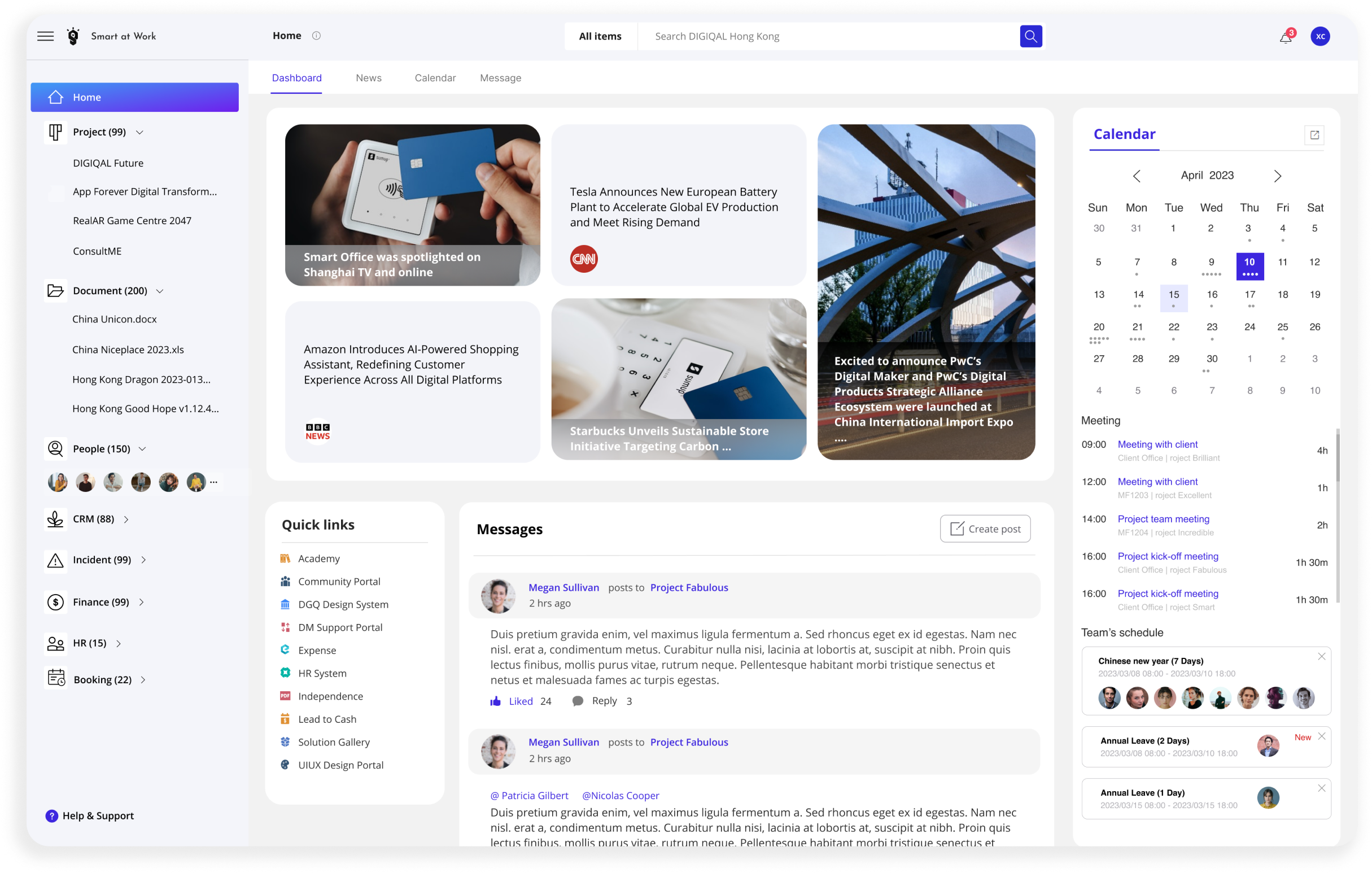
Smart at Work enables organizations to operate digitally with high productivity, agility and efficiency. However, its non-intuitive workflow and usability issues hindered users’ efficiency.
Journey mapping and direct feedback helped uncover where people were losing time and confidence in everyday tasks.
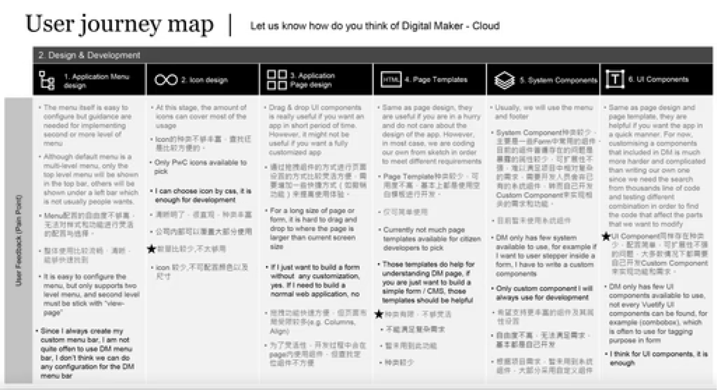
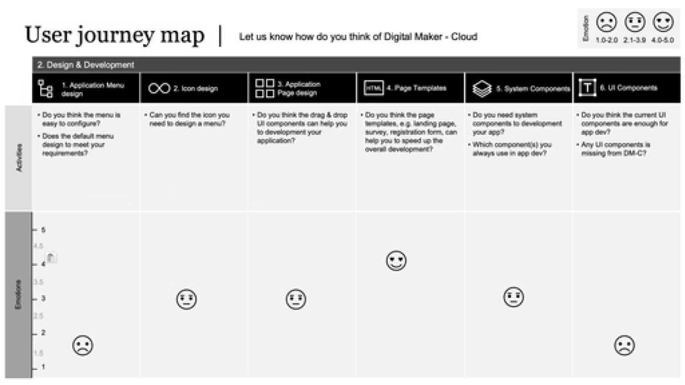
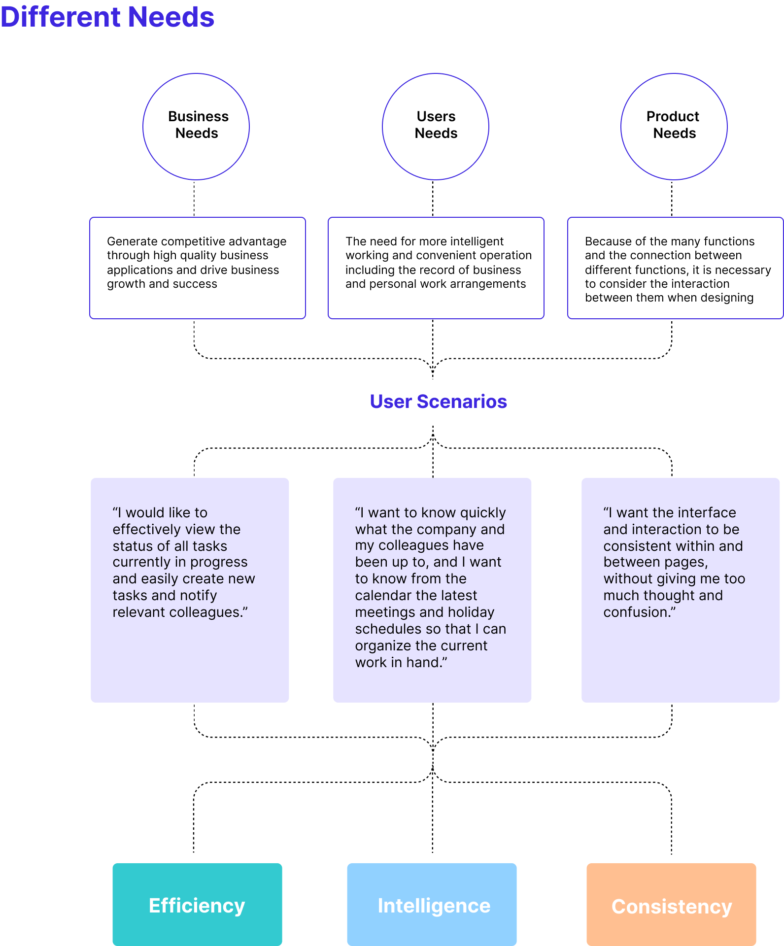
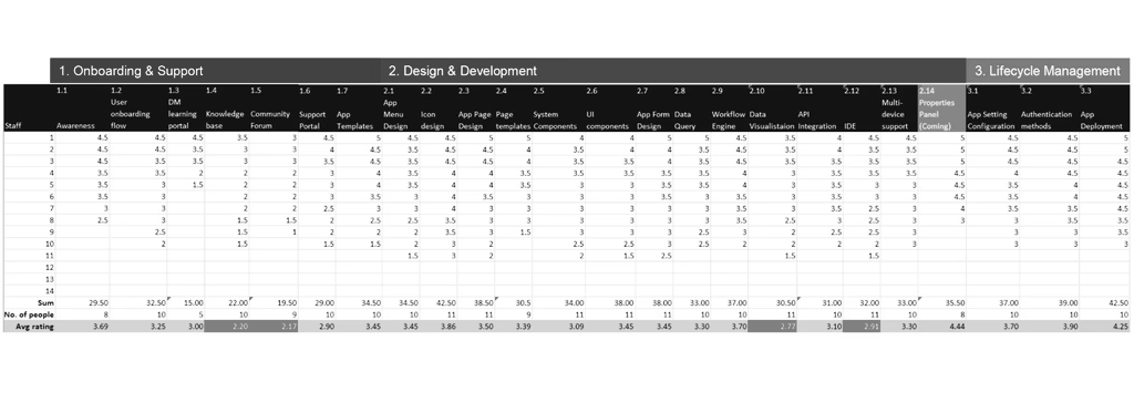
A second survey clarified which areas required the most urgent improvements.
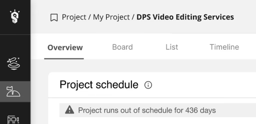
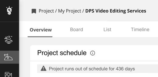
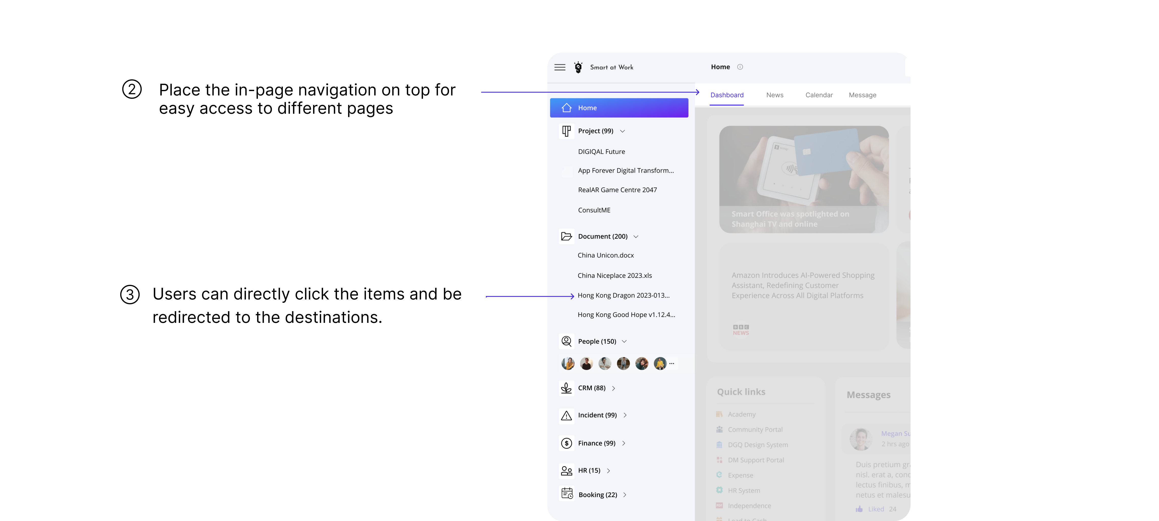
Users experienced delays accessing projects, struggled to find documents and found common collaboration tasks inefficient.

Hustle and time-consuming
to arrive wanted page
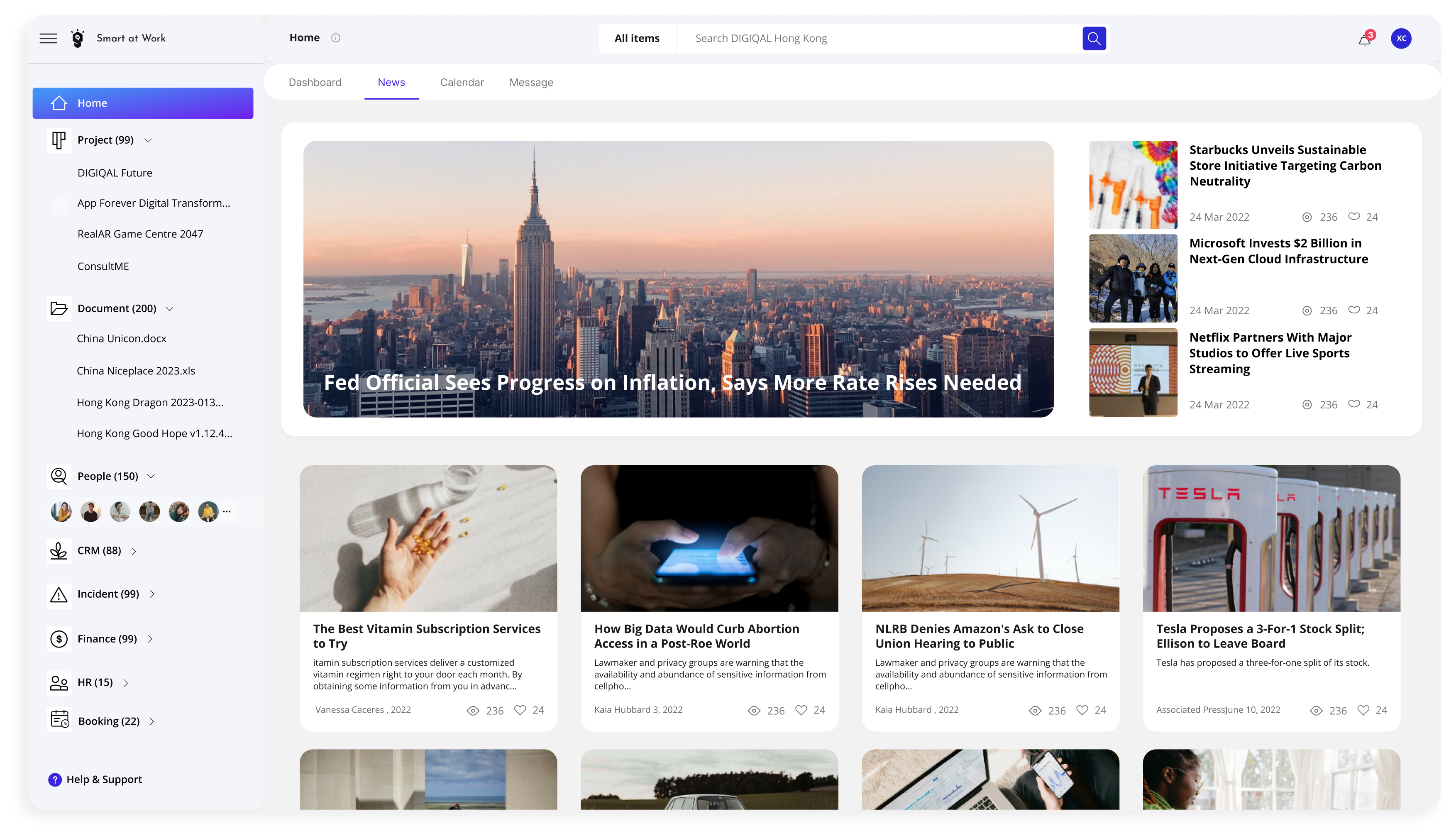
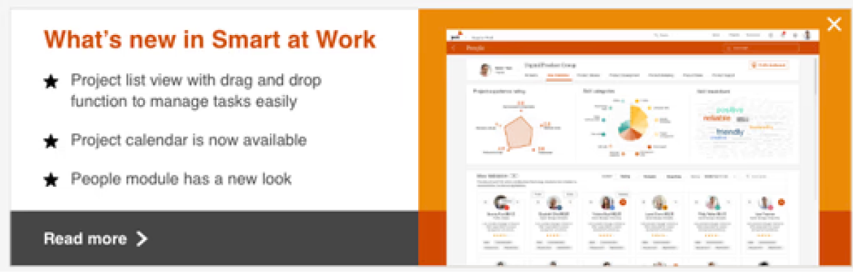
The original module showed one article while occupying too much space. The redesign explored ways to increase information density without adding effort.
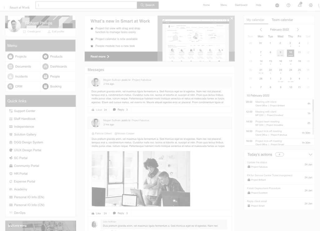
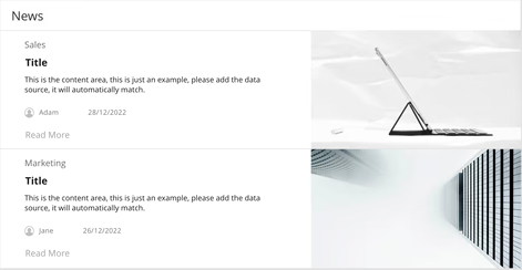
Pro: Two articles with introductions are visible.
Con: Users can still only read two stories.
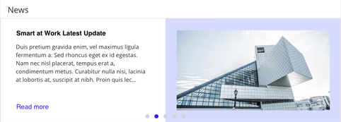
Pro: Five stories are available through the carousel.
Con: Users may leave before later stories appear.
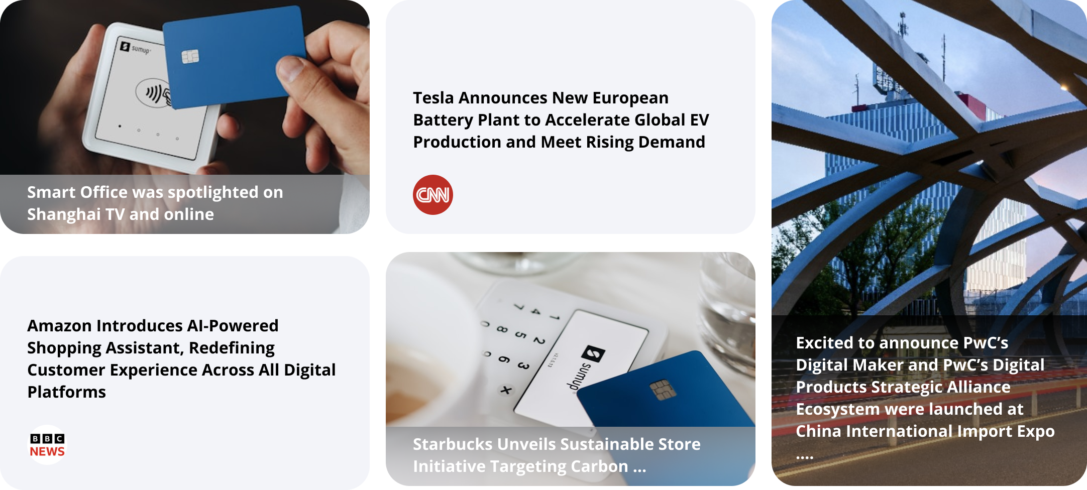
Pro: Five articles are immediately visible without waiting or clicking.
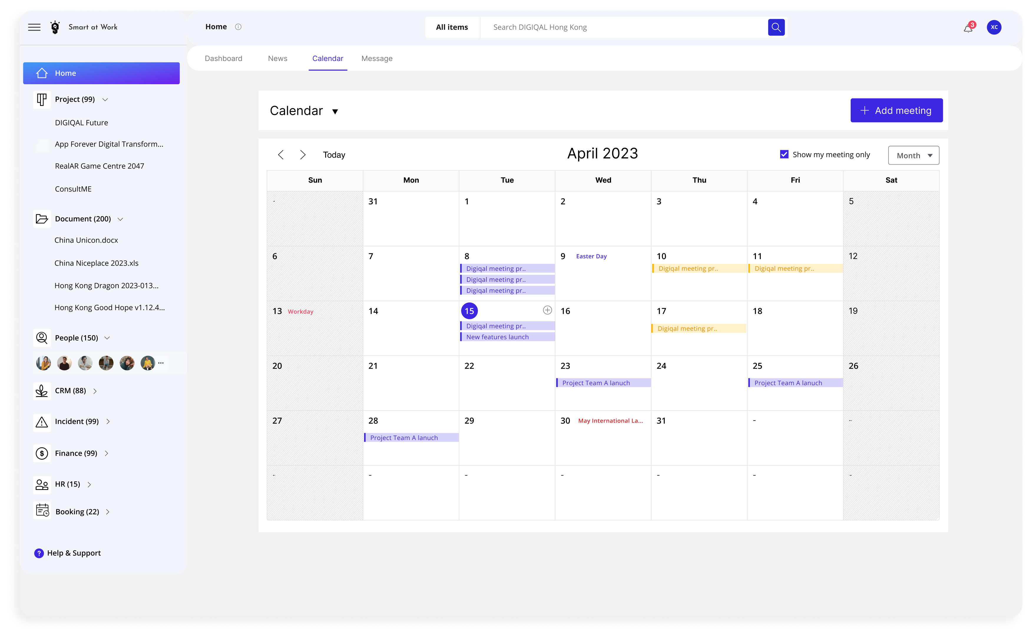
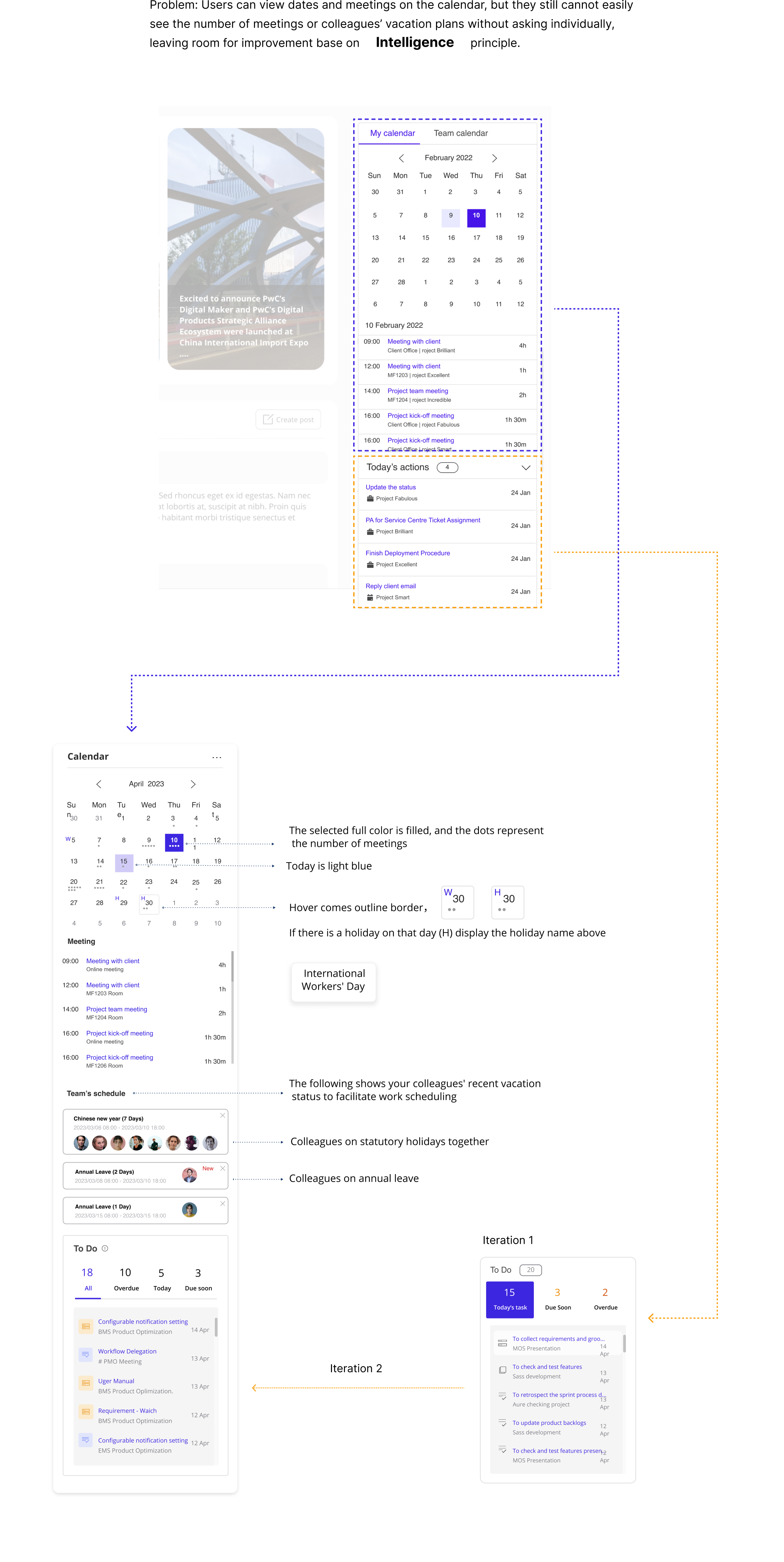
Meeting density, holidays and colleagues’ leave status are brought together to help people schedule work confidently.
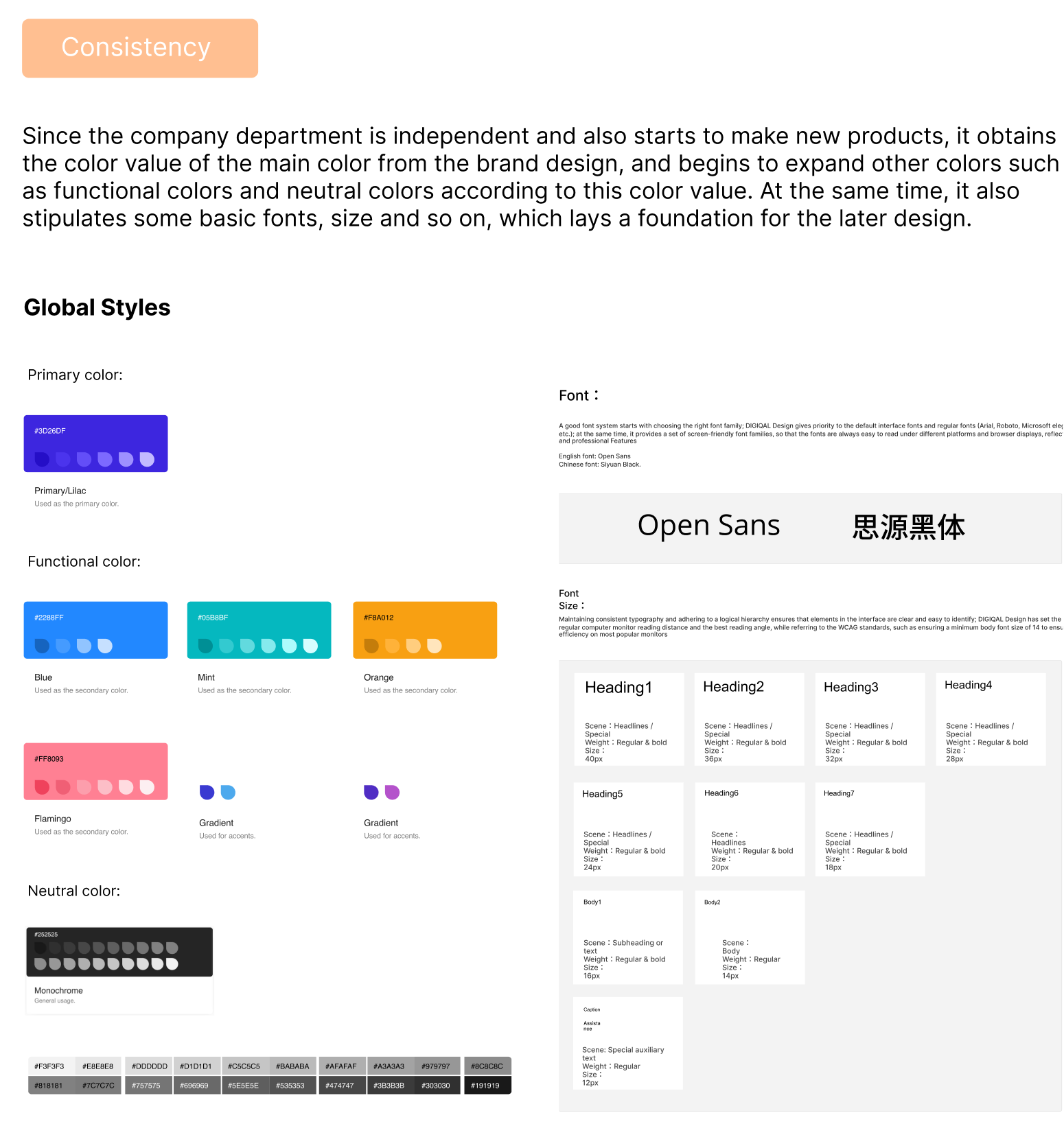
Shared colors, typography and interface rules create a consistent foundation for the platform.
According to one of the three previously established principles, "Consistency," is necessary to set the foundational colors and fonts for the platform at the beginning. Please refer to another article for the complete design system.
The final index page combines the improved navigation, higher-density news and intelligent calendar experience.
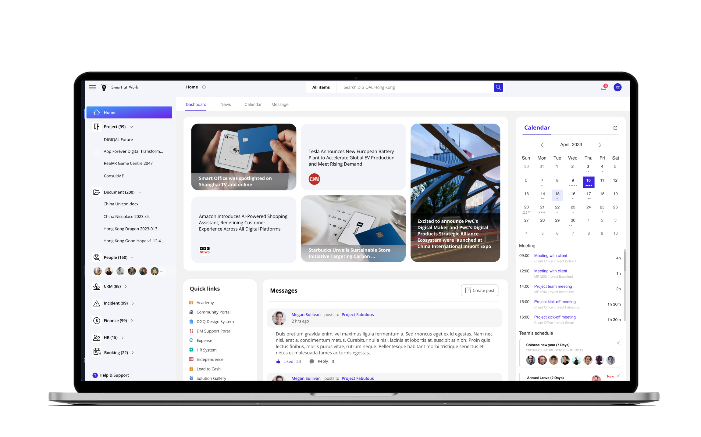
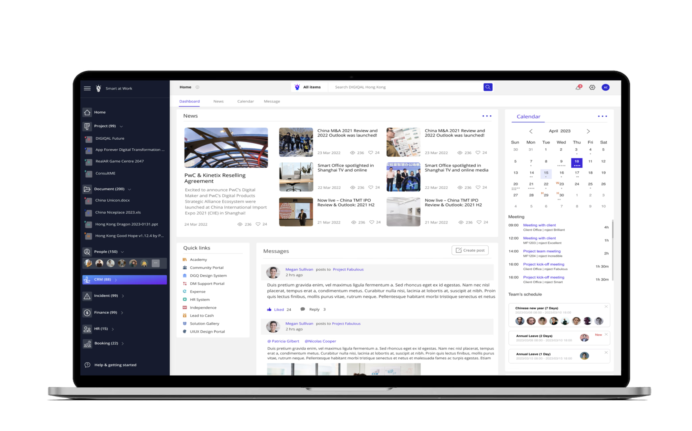
Usability improvements increased satisfaction while reducing the time needed for frequent tasks.
Satisfaction Rate
 88%
88%Time Reduction


Ningning Zhang
“You successfully shortened the operation path, making the site convenient and fast. These changes improved my productivity and let me focus more on my work.”

Danny Zheng
“I can easily check vacation dates, public schedules and upcoming tasks. These thoughtful features make collaboration more enjoyable and efficient.”

Emily Wong
“The expanded homepage makes company news, industry updates and events easily accessible, while fostering better team connectivity.”